Three Composition Elements For Better Food Photography
Composition in all forms of art is incredibly important. Photography is no exception. Food photography composition is a bit different in terms of the compositional process vs. other niches that are incredibly fast-paced.
Depending on your photographic niche, moments unfold quickly and are gone in an instant. This is especially true for event and wedding photographers.
Other types of photography, especially those that are studio-based do have more flexibility.
For instance, any form of still-life photography (such as food or product photography), photographers have the luxury of putting a scene together and changing elements as we shoot. With other types of photography, it is a consistent flow of shots, one after the next.
I would argue that composition can be intuitive if you have a firm grasp on other aspects of art such as design, color, and lines.
That being said, it is a perpetual practice and it is something that all photographers should strive to continuously improve.
In my face-to-face photography courses, I do an exercise where the students have to pick a subject and work the scene, shooting anywhere from 40-50 photos of the same scene and objects.
The goal of this small assignment is to instill the idea of moving round a scene in the students.
The more photos you take while learning photography and composition, the more you will see and even feel the composition. It is my hope that you’ll shoot many more than 50 frames if you plan to give this composition exercise a try!
There are a few compositional techniques that will help improve your food photography.
I’ve only included five elements to create compelling food photography in this post so that we could dig into each of them.
There is so much more to photography composition that I would encourage you to explore and these are truly just the beginning.
Understanding food photography composition techniques is essential for creating visually appealing images.
I hope that the following food photography composition tips help to get you started as you create great food photos.
Understanding Food Photography Composition
Food photography composition is the art of arranging visual elements within a frame to create a visually appealing and engaging image.
It’s a crucial aspect of food photography, as it can make or break the success of an image.
A well-composed image can evoke emotions, convey a message, and even make the viewer’s mouth water.
Whether you’re a seasoned food photographer or just starting out, mastering composition techniques can elevate your food photos to the next level.
What Makes a Photo Good?
A good food photo is one that effectively communicates the story of the dish, evokes the viewer’s emotions, and makes them want to take a bite.
It should have a clear subject that stands out, a balanced composition that guides the viewer’s eye, and a visually appealing aesthetic that highlights the food’s best features.
The colors, textures, and shapes in the image should work together harmoniously to create an appetizing visual experience.
Think about how the elements in your frame interact and complement each other to create a cohesive and mouth-watering image.
Compositional Element #1: Viewpoint and Camera Angles
What is a viewpoint?
The viewpoint is the physical location that you are shooting from. If you step over a foot or two, you’ll have a completely new viewpoint and the scene in front of you will look a bit different.
I struggle with this one a lot and tend to use the same viewpoint over and over, which can get a bit boring.
This tends to happen when the photographer gets comfortable with the specific placement of the camera in relation to the food in the scene.
If something is working, why not continue to do it?
Because of that mentality, creatives can get stuck in this type of rut. It’s great to break out of our comfort zone, and try new points of view and angles!
If you are shooting food for a client, or even your food blog or other online publication you should make sure you have optimal coverage in terms of angles.
Additionally, preventing camera shake is crucial to achieving clear and crisp images, so consider using a tripod or other stabilizing techniques.
This means shooting the same dish in at least three different ways. Are there more angles than just 3, yes absolutely! And there are unlimited viewpoints. But these three will give you a good place to start.
What is the difference between viewpoint and angle?
Viewpoints and angles are similar in terms of composition, but they are a bit different, all at the same time.
The viewpoint is where you are in relation to your scene, the angle is how your camera is tilted and pointed towards the scene.
You can have the same angle pointed towards the food, but have a different point of view all at the same time.
They can ( and do) go hand-in-hand while discussing composition.
Shutter speed also plays a crucial role in food photography settings, as it controls light exposure and motion blur, impacting image clarity in varying lighting conditions.
Common Angles to Consider for food photography
There are 3 main angles that I use in my food photography, but there are many more that you should consider and practice utilizing. This is mostly to give you a starting point while considering. Remember, while a fancy camera can enhance your photos, mastering angles and composition is what truly makes the difference.
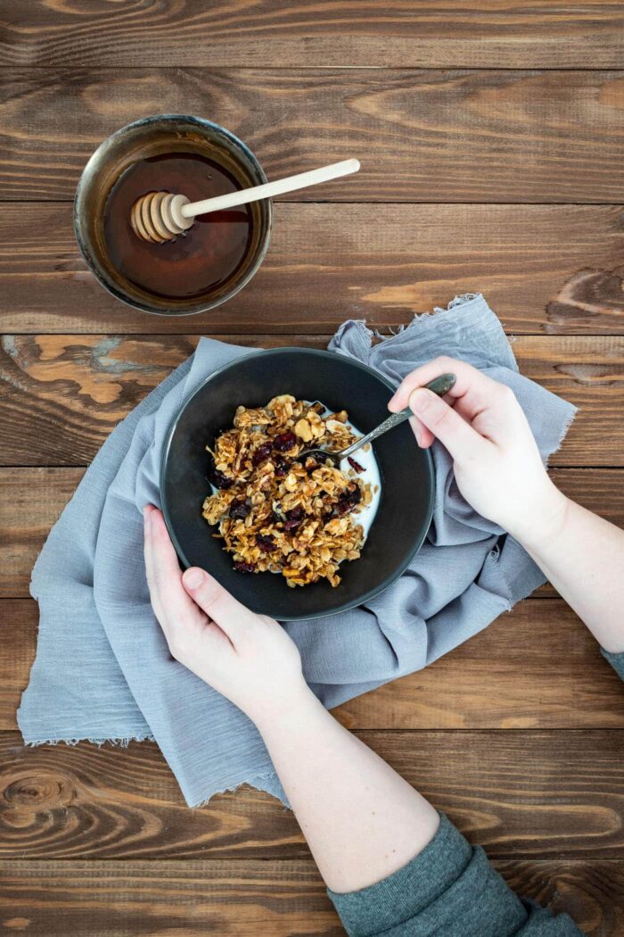
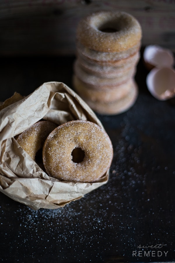
90 degrees/Overhead
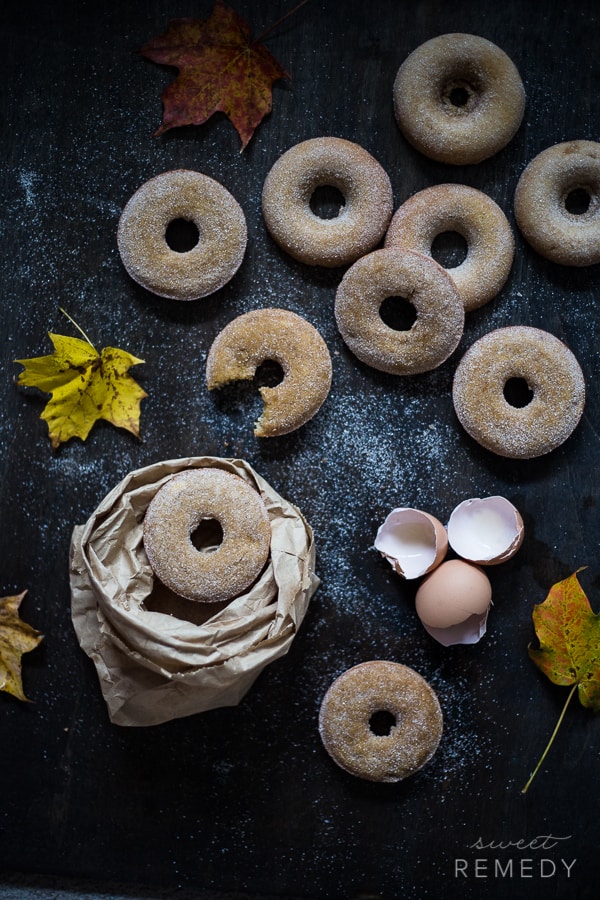
Take a look at the first image above with the leaves and a bite out of the donut.
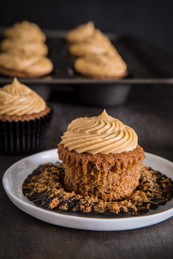
45 degrees
The photo above was shot around 45 degrees.
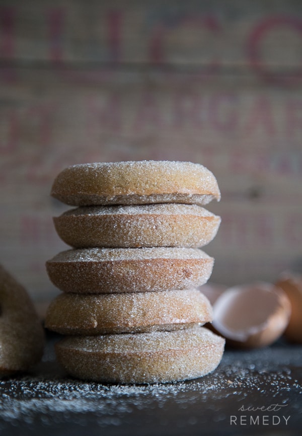
0 degrees/straight on
The last image of the donuts was shot straight on.
Should you shoot horizontally or vertically?
Deciding if you should shoot horizontally or vertically is another task that will improve your images.
My advice is to shoot both horizontally and vertically for each of the three ways listed above.
This will ensure you have many different viewpoints to choose from during post-processing and it gives you options.
This approach can help create balance in your photos by allowing you to experiment with different compositions.
Some will work better than others and it will become clear which images to use as you go through the culling and editing process.
Compositional Element #2: The Rule of Thirds
The rule of thirds is a fundamental composition technique used in food photography. It involves dividing the frame into nine equal rectangles, with two vertical and two horizontal lines.
The points where these lines intersect are the key points of interest, and the subject should be placed on or near one of these points.
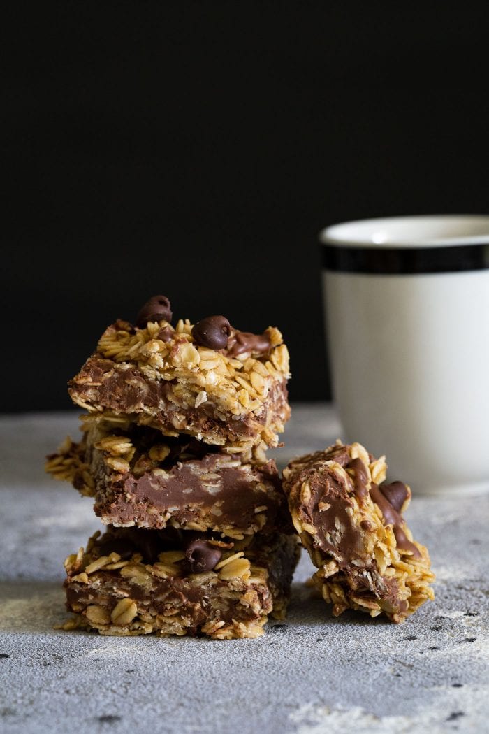
This technique helps create a balanced and visually appealing composition by naturally drawing the viewer’s eye to the most important parts of the image.
By aligning your main subject with these intersections, you can create a more dynamic and engaging food photo.
Compositional Element #3: Lines and Shapes
Lines and shapes are essential elements in food photography composition. Lines can be used to create a sense of movement, direction, or energy in the image.
For instance, the lines of a fork or spoon can lead the viewer’s eye towards the main dish.
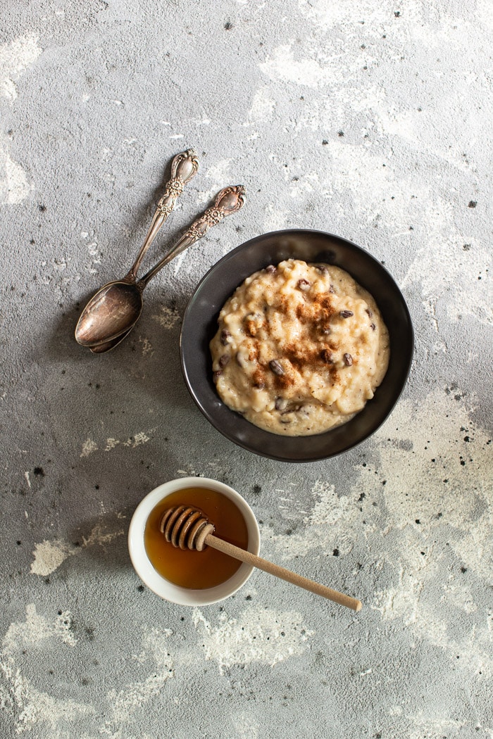
Shapes, on the other hand, can be used to create a sense of harmony, balance, or contrast. Circular plates, rectangular napkins, and triangular slices of cake all add different visual elements to your composition.
Food bloggers and food photographers can use lines and shapes to guide the viewer’s eye through the image and create a sense of visual flow, making the food look even more enticing.
Compositional Element #4: Depth
What is Depth?
If you are able to create a foreground, middle ground, and background in an image, you have just created depth.
It is helpful to think of a photograph as a story, in this case, all stories have a beginning, middle, and end, similar to the depth in a photo!
When we talk about depth in terms of composition, we are really talking about two things:
- The background blur (the depth of field)
- Where objects are placed within the frame.
We’ll dig into both below!
Additionally, adjusting your ISO value and shutter speed can allow more light to reach the sensor, enhancing depth and clarity in low-light scenarios.
How to Create Depth?
One way to use depth in your food photography is to use a layering tactic to place objects within your frame.
You’ll start by determining which objects you’d like to use to support the food in the shot. Then take these different objects a place them into the three planes of a photo in a pleasing way. You can even put some of these objects such as a bowl or a spoon halfway out of the frame.
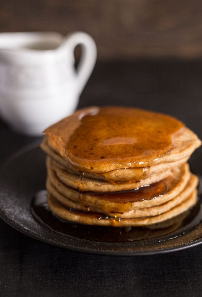
It’s okay to leave some parts of the photo up to the viewer’s imagination. Natural light can enhance the depth and quality of your images by providing even illumination without harsh shadows.
You’ll want to play around with the position of each object and move them around your scene as you shoot.
You’ll also want to move your camera, tripod, and your own body around the scene to find the very best angle, as discussed above.
You’ll also want to work on playing with the depth of field of your images.
What is Shallow Depth of Field?
The other is to create depth of field.
When you see an image with something really sharp in the one part of the image, let’s say the foreground, and the rest of the image becomes increasingly blurry this is usually referred to as shadow depth of field or bokeh.
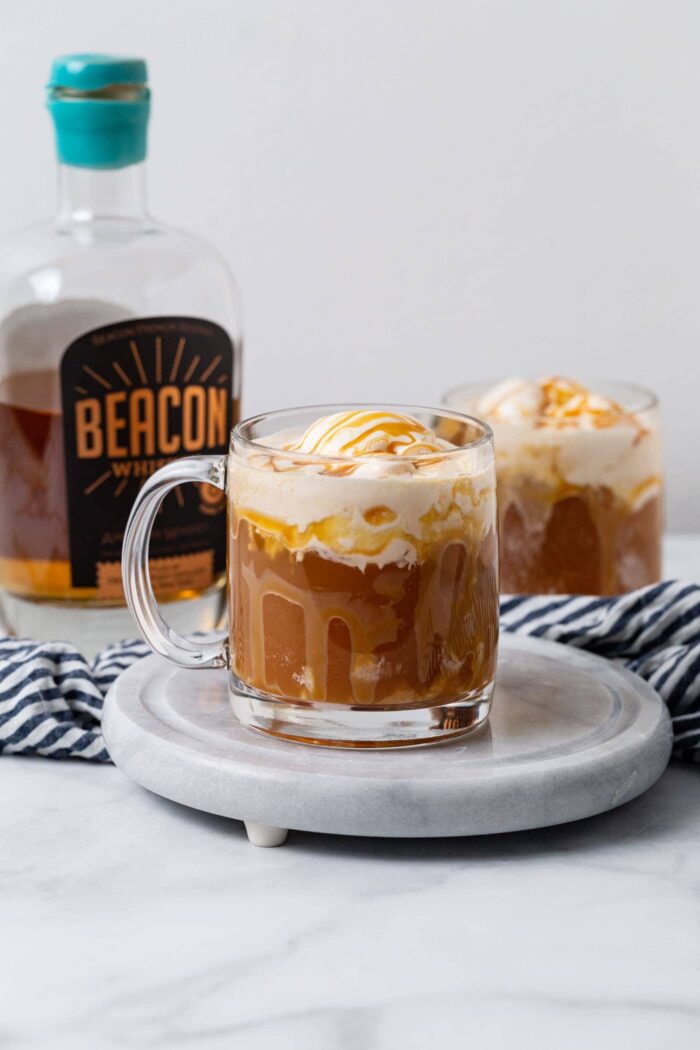
To obtain this aesthetic you have to set your aperture (f-stop) to a low number or “wide open” as this creates a larger opening.
This will result in a shallow depth of field (parts of the image are out of focus/blurry, typically the background in food photography!)
I’d start out with a f/5 and work my way down to f/2.8 (your lowest possible aperture depends on your lens. Some lenses only go to f/4 while others can go to f/1.2.)
Using a slower shutter speed can also help in low-light conditions but may result in motion blur.
Framing and Layers
Framing and layers are composition techniques used to create depth and interest in food photography.
Framing involves using objects or elements in the scene to create a frame around the subject, such as shooting through a window or using the edge of a table.
This technique can help draw attention to the main subject and add context to the scene. Layers involve creating a sense of depth by using different planes or levels in the image.
For example, placing a napkin in the foreground, the main dish in the middle ground, and a blurred background can add dimensionality to your food photos.
These techniques can help create a sense of visual interest and make your food images more engaging and dynamic.
By understanding and applying these composition techniques, you can create food photos that are not only visually appealing but also tell a story and evoke emotions.
Whether you’re shooting for a blog, a magazine, or just for fun, mastering these elements will help you create stunning food photography compositions.
Compositional Element #5 Negative Space
What is negative space?
Negative space is when specific sections of your photo are empty. In other words, there is nothing interesting happening in that area of the image.
Designers often refer to this as white space. There really isn’t anything super interesting going on and all of the exciting stuff in the photo can be found in other areas, also referred to as Positive Space.
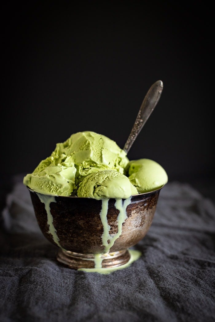
Negative space is your friend! Especially in food photography, where we know that, as bloggers, we’ll want to leave some room throughout the photo to add text and call out the recipe.
This text is helpful for image-based searches like Pinterest.
The negative space does not draw the viewer’s eye to it; essentially, it is there as a backdrop to let the positive space shine. For food photographers, positive space is the star of the image: the food.
While taking images, try to think of the purpose of that specific image. Here are some specific questions to ask yourself while you’re in the moment:
Will there be text or other graphics?
Are you leaving enough room for them to be added?
Where do I want the viewers’ attention?
If you were shooting for a magazine with the text for the left side of an image you might do something similar to the photo below on the right side.
This would be nice negative space for a recipe or teaser content for what’s inside, think the cover of a magazine!
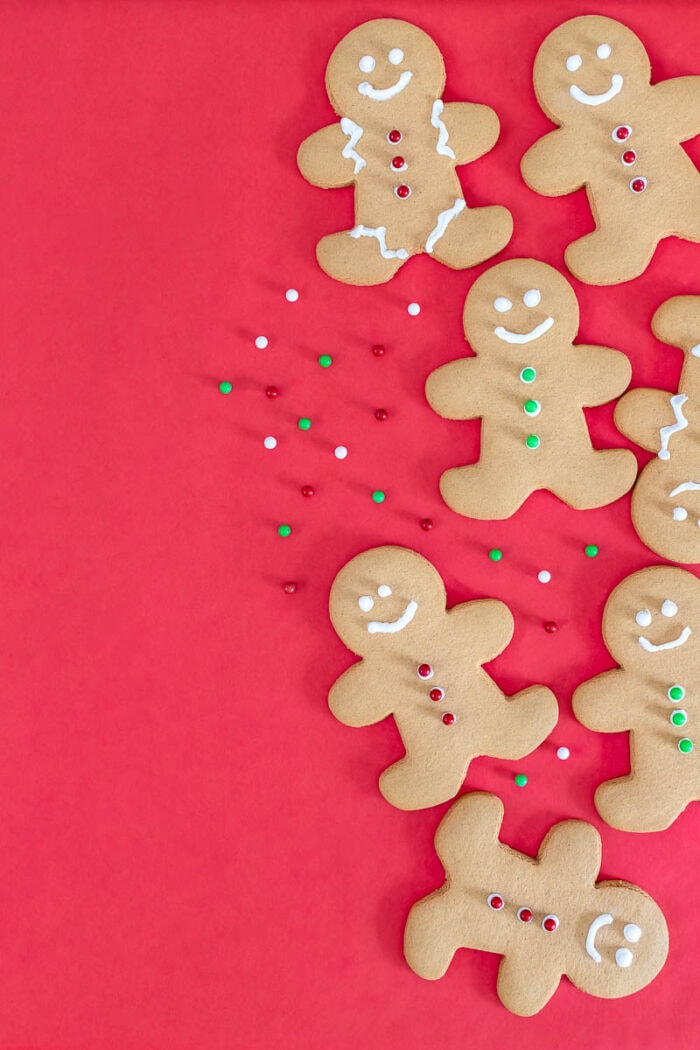
How to add negative space to your food photo
Cut down on the use of props
Use depth of field to your advantage (as illustrated above)
Zoom out to add more of the background
Find a blank background to shoot your food against
You can utilize a combination of the above techniques to help you add negative space to your food photography.
Negative space can also help you tell a story.
Remember that every time you set up a scene to capture, you have the ability to focus on storytelling elements.
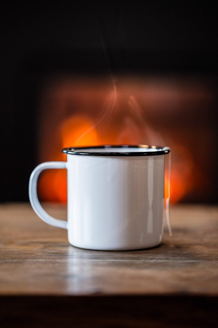
In the photo above, I’ve focused my positive space on the mug of tea and the negative space became the fireplace and the surrounding area. I’ve also used depth to ensure that the fireplace is just a bit out of focus, furthering the negative space.
What kind of story does this tell? I believe it sets the stage for a cozy winter evening, perhaps at a ski lodge or some other type of winter wonderland. If I had added more objects to the small table, perhaps a book or a second cup of tea, the story would be a bit different.
Negative space helps convey an emotion
Sometimes, it is all about what you don’t say that plays with people’s emotions.
The same is true for photography. If you leave specific elements or information out (by using negative space instead) you are allowing the viewer to create their own story and feelings based on what is not there.
Negative space can add tension to a scene, depending on how you utilize it.
Deciding on your positive space first will help you create negative space
When you already know what your positive space will be a stack of pancakes, then you can use other elements around you, and other compositional elements such as balance and depth to create negative space.
Negative space will help you balance out an image
Balance is another compositional element that deals a lot with negative space.
In a way, they go hand in hand. In order to have negative space and positive space working together to create a compelling image, you will be trying to achieve balance.
Viewpoint, rule of thirds, lines and shape, depth, and negative spaces are five compositional elements that you can use to level up your food photography.
If you’re finding yourself in a compositional rut, or you are just getting started, my advice would be to pick a few techniques and really focus on them one by one to get the food photographs of your dreams!

